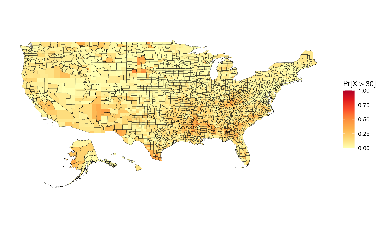
Vizumap is a tool for visualising uncertainty in spatial data. This vignette demonstrates how to use the package to create bivariate maps, pixel maps, glyph maps, and exceedance probability maps. We have tried to generalise the visualisation approaches so that they are applicable for most types of spatial data.
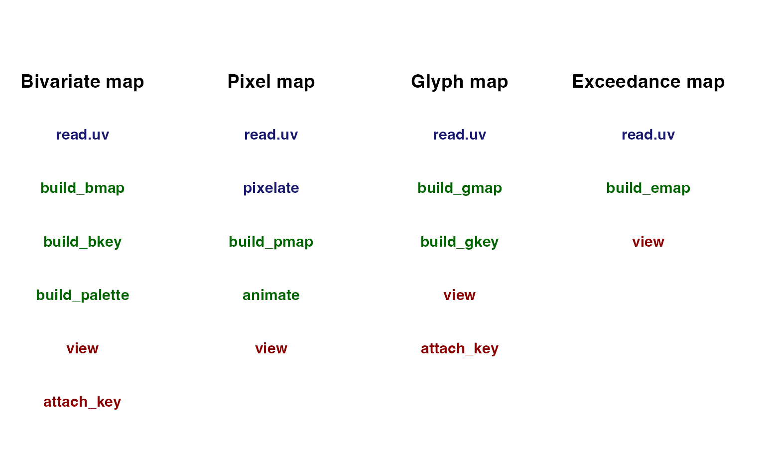
There are three types of functions in Vizumap:
formatting functions, building functions, and viewing functions.
Formatting functions prepare data frames and spatial polygons for use in
building functions. Building functions create maps, animations, keys,
and colour palettes. Viewing functions plot these objects. Some of these
functions are useful across all four map types, such as
read.uv, and others are map specific, such as
pixelate. Below is a table displaying the functions that
can be used with each map type. Blue functions format. Green functions
create. Red functions plot.
Data
One of the included datasets in the Vizumap package
is us_data, which contains the estimated family poverty
rates for all US counties in 2015. Also included is a spatial polygons
data frame for a US county map (us_geo), which can be used
to map the estimates and errors in us_data. These data come
from the US Census Bureau Fact
Finder website, and documentation can be found under
?us_data and ?us_geo.
##           GEO_ID GEO.id2       GEO.display.label pov_rate pov_moe
## 1 0500000US01001    1001 Autauga County, Alabama      9.3     1.9
## 2 0500000US01003    1003 Baldwin County, Alabama      9.6     1.1
## 3 0500000US01005    1005 Barbour County, Alabama     19.5     2.8
## 4 0500000US01007    1007    Bibb County, Alabama     12.8     4.4
## 5 0500000US01009    1009  Blount County, Alabama     12.3     2.0
## 6 0500000US01011    1011 Bullock County, Alabama     22.7     6.5
data(us_geo)Building bivariate maps
A bivariate map is based on a bivariate colour palette, which is created by blending two single hue colour palettes. One colour palette represents the variable of interest while the other represents the uncertainty. When the palettes are blended, each colour in the new palette becomes representative of both a variable class and uncertainty class.
There are four pre-prepared bivariate colour palettes included in
Vizumap: 'BlueYellow',
'CyanMagenta', 'BlueRed' and
'GreenBlue'.
# use one of four pre-prepared colour palettes
cmBivPal <- build_palette(name = "CyanMagenta")
view(cmBivPal)
You can also design your own bivariate colour palette with
build_palette. Instead of entering one of the four
pre-prepared palettes into name, you enter
'usr'. If you choose two light colours when creating your
own palette, the palette will lack important differences in colour
across the grid. Therefore, it is best to use two darker colours. For
example, 'chartreusu4' and 'darkblue' work
better than 'tan2' and 'lightskyblue' (see
comparison below). The numeric vector passed to difC
controls the colour change across each single hue colour gradient.
# test two light colours with low difC values
# creates a bad palette
customBivPal1 <- build_palette(name = "usr", colrange = list(colour = c("tan2", "lightskyblue"), difC = c(1, 1)))
view(customBivPal1)
# change colours for a better palette
customBivPal2 <- build_palette(name = "usr", colrange = list(colour = c("chartreuse4", "darkblue"), difC = c(1, 1)))
view(customBivPal2)
# change difC values to increase colour differences
customBivPal3 <- build_palette(name = "usr", colrange = list(colour = c("chartreuse4", "darkblue"), difC = c(3, 4)))
view(customBivPal3)
A bivariate map can be used to simultaneously visualise the estimates
and errors in us_data. Before the data frame of estimates
and errors is passed to build_bmap, it must be formatted
with read.uv as the estimates and errors need to be in the
first and second columns of the data frame. You can also import a
dataset by passing a CSV file pathway to file.
##           GEO_ID GEO.id2       GEO.display.label pov_rate pov_moe
## 1 0500000US01001    1001 Autauga County, Alabama      9.3     1.9
## 2 0500000US01003    1003 Baldwin County, Alabama      9.6     1.1
## 3 0500000US01005    1005 Barbour County, Alabama     19.5     2.8
## 4 0500000US01007    1007    Bibb County, Alabama     12.8     4.4
## 5 0500000US01009    1009  Blount County, Alabama     12.3     2.0
## 6 0500000US01011    1011 Bullock County, Alabama     22.7     6.5
# format data frame
poverty <- read.uv(data = us_data, estimate = "pov_rate", error = "pov_moe")

# estimates and errors are now in the first two columns
head(poverty)
## pov_rate pov_moe GEO_ID GEO.id2 GEO.display.label
## 1 9.3 1.9 0500000US01001 1001 Autauga County, Alabama
## 2 9.6 1.1 0500000US01003 1003 Baldwin County, Alabama
## 3 19.5 2.8 0500000US01005 1005 Barbour County, Alabama
## 4 12.8 4.4 0500000US01007 1007 Bibb County, Alabama
## 5 12.3 2.0 0500000US01009 1009 Blount County, Alabama
## 6 22.7 6.5 0500000US01011 1011 Bullock County, AlabamaIn this example, terciles are used to define the numerical bounds for the different estimate and error classes because the dataset contains several outliers.
# build a bivariate map with the map data
usBivMap <- build_bmap(data = poverty, geoData = us_geo, id = "GEO_ID", terciles = TRUE)
view(usBivMap)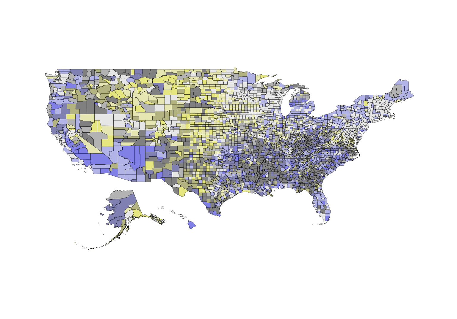
Keys for the bivariate maps are not automatically generated with
build_bmap and must be created separately with
build_bkey. It is important that the key arguments match
the map arguments. For example, if terciles was set to
FALSE, the key would not accurately reflect the county
colour assignments for this example US map.
# build a key
usBivKey <- build_bkey(data = poverty, terciles = TRUE)
view(usBivKey)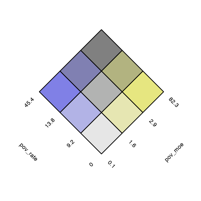
Maps and keys can be viewed together with
attach_key.
attach_key(usBivMap, usBivKey)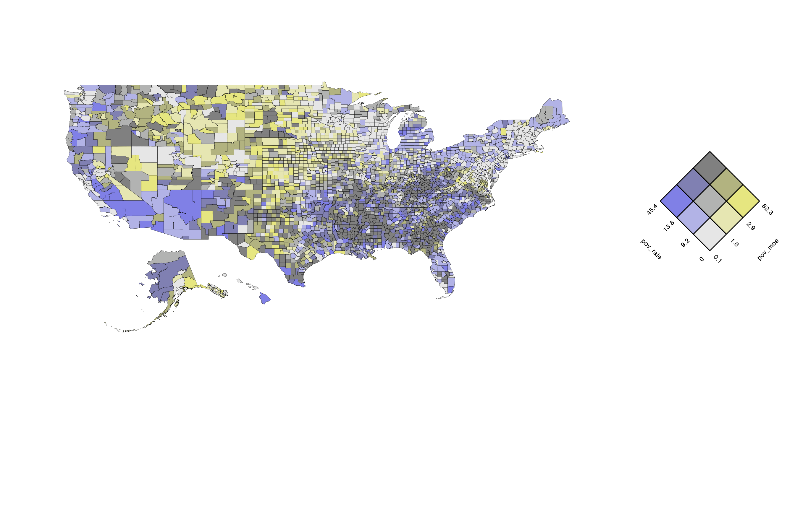
Changing the terciles and palette arguments
leads to a map that looks very different than the previous map even
though it is displaying the same dataset. Here the custom colour palette
is used.
# make some changes
usBivMapDif <- build_bmap(data = poverty, geoData = us_geo, id = "GEO_ID", terciles = FALSE, palette = customBivPal3)
view(usBivMapDif)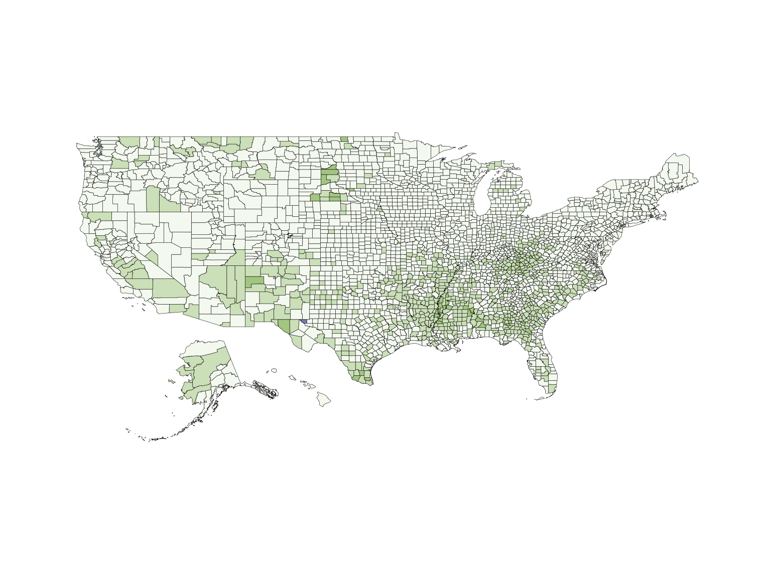
Building pixel maps
Pixel maps are created by pixelating regions and assigning each pixel
in a region a value from an estimate’s confidence interval or discrete
relative frequency distribution. The first step is to format the data
frame containing the data with read.uv and pixelate the map
with pixelate.
A California county map will be used to illustrate the method. A
subset of us_data that contains only California estimates
and errors is created.
data(us_data)
us_data$GEO.id2 <- as.numeric(us_data$GEO.id2)
ca_data <- subset(us_data, us_data$GEO.id2 > 6000 & us_data$GEO.id2 < 7000)
ca_data <- read.uv(data = ca_data, estimate = "pov_rate", error = "pov_moe")
row.names(ca_data) <- seq(1, nrow(ca_data), 1)
The county polygons for California are extracted from
us_geo and pixelated with pixelate. It can
take several minutes to pixelate a shapefile depending on the size of
the shapefile.
data(us_geo)
ca_geo <- subset(us_geo, us_geo@data$STATE == "06")
pix <- pixelate(ca_geo, pixelSize = 70, id = "GEO_ID")
If distribution = "uniform", the values are sampled
uniformly from an interval, where the lower bound is the estimate minus
the error and the upper bound is the estimate plus the error. For the
estimates and margins of error in us_data, this interval
corresponds to the estimate’s 90% confidence interval.
# uniform distribution
unifPixMap <- build_pmap(data = ca_data, distribution = "uniform", pixelGeo = pix, id = "GEO_ID", border = ca_geo)
## Warning: `fortify(<SpatialPolygonsDataFrame>)` was deprecated in ggplot2 3.4.4.
## ℹ Please migrate to sf.
## ℹ The deprecated feature was likely used in the Vizumap package.
## Please report the issue to the authors.
## This warning is displayed once every 8 hours.
## Call `lifecycle::last_lifecycle_warnings()` to see where this warning was
## generated.
view(unifPixMap)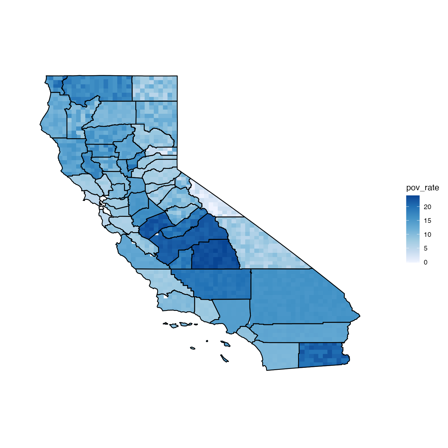
If distribution = "normal", the values assigned to
pixels will be drawn from normal distributions parameterised using the
estimates and errors (means and standard deviations).
# normal distribution
ca_data$se <- ca_data$pov_moe / 1.645
ca_data <- read.uv(data = ca_data, estimate = "pov_rate", error = "se")

normPixMap <- build_pmap(data = ca_data, distribution = "normal", pixelGeo = pix, id = "GEO_ID", border = ca_geo)
view(normPixMap)
If distribution = "discrete", a data frame of quantiles,
which define the relative frequency distributions for the estimates,
must be passed to q. Below is what the California map would
look like if the relative frequency distributions for the estimates
followed exponential distributions.
# experiment with discrete distribution
# exponential - example for q argument
ca_data.q <- with(ca_data, data.frame(p0.05 = qexp(0.05, 1/pov_rate), p0.25 = qexp(0.25, 1/pov_rate), p0.5 = qexp(0.5, 1/pov_rate), p0.75 = qexp(0.75, 1/pov_rate), p0.95 = qexp(0.95, 1/pov_rate)))

head(ca_data.q)
## p0.05 p0.25 p0.5 p0.75 p0.95
## 1 0.4359930 2.445298 5.891751 11.783502 25.46372
## 2 0.4308637 2.416529 5.822436 11.644873 25.16415
## 3 0.3590531 2.013775 4.852030 9.704061 20.97013
## 4 0.6719422 3.768635 9.080228 18.160456 39.24409
## 5 0.4000877 2.243920 5.406548 10.813096 23.36671
## 6 0.6103902 3.423417 8.248451 16.496903 35.64921
discPixMap <- build_pmap(data = ca_data, distribution = "discrete",
                  pixelGeo = pix, id = "GEO_ID", q = ca_data.q, border = ca_geo)
view(discPixMap)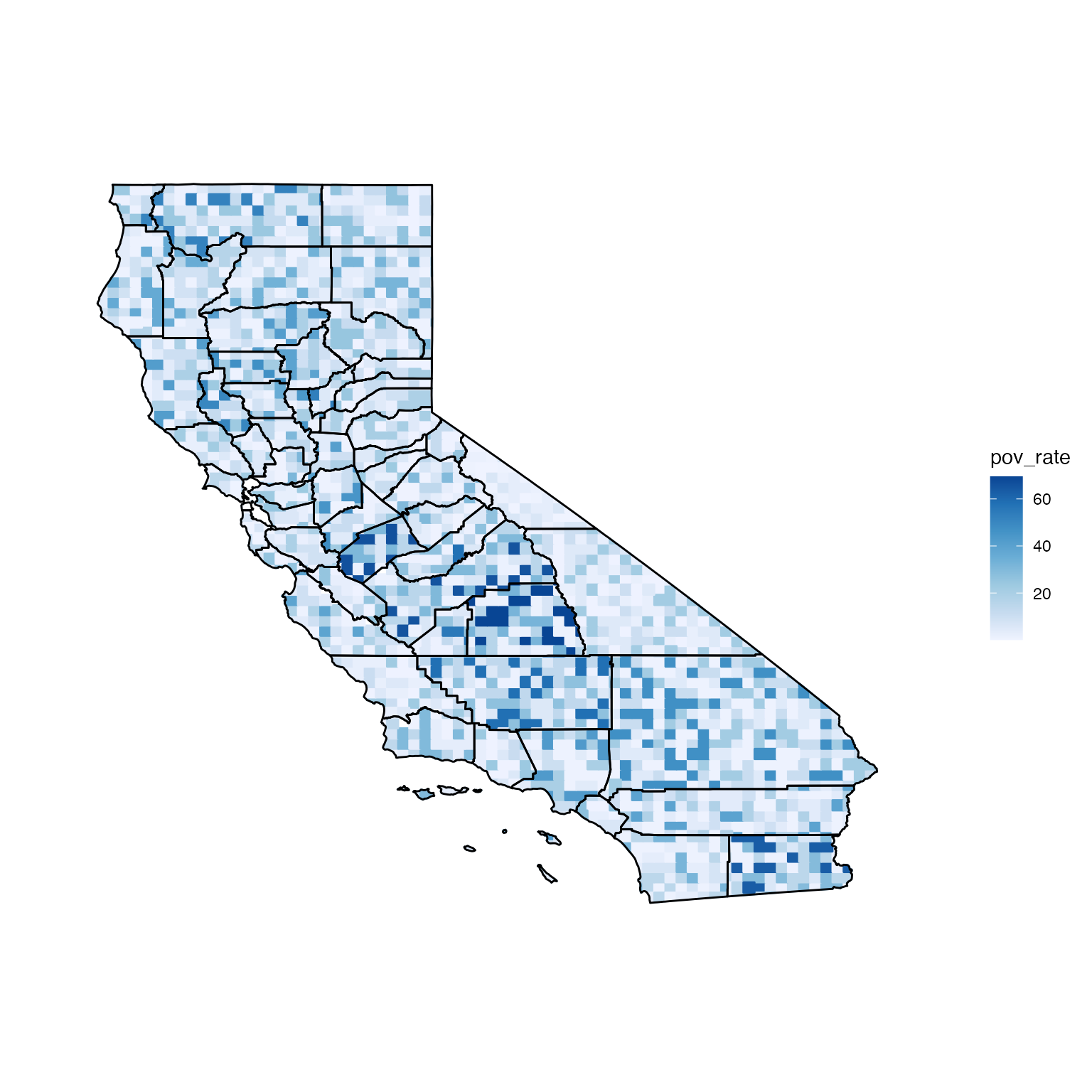
Pixel maps can be animated with animate so that the
pixels flicker between a series of assigned values. view
saves the animation to your computer as an html file and automatically
opens a browser to view it. A longer aniLength corresponds
to a longer animation as well as a longer running time. Generating the
animation with view can take several minutes.
# animate the normal distribution map
normPixAni <- animate(normPixMap, aniLength = 30)
# view(normPixAni)
Building glyph maps
The process of creating a glyph map is very similar to the process of creating a bivariate map. The data are formatted; the map is created; the key is created; and the two are merged. Glyphs are plotted at either region centroids or specific sites, and the colour and rotation of the glyph represent the variable of interest and the uncertainty. The method is illustrated below with a Colorado county map.
The datasets are loaded and subsetted. co_data is
formatted with read.uv for use in build_gmap
and buid_gkey.
data(us_data)
data(us_geo)

co_geo <- subset(us_geo, us_geo@data$STATE == "08")

us_data$GEO.id2 <- as.numeric(us_data$GEO.id2)
co_data <- subset(us_data, us_data$GEO.id2 > 8000 & us_data$GEO.id2 < 9000)
co_data <- read.uv(data = co_data, estimate = "pov_rate", error = "pov_moe")
Because geoData is included in this example, the
build_gmap function will plot a glyph at each region
centroid. The colour of the glyph represents the estimated poverty rate
among families, and the rotation of the glyph represents the margin of
error for the estimate.
# build a glyph map
usGlyphMap <- build_gmap(data = co_data, geoData = co_geo, id = "GEO_ID", size = 80, glyph = "icone", border = "state")
view(usGlyphMap)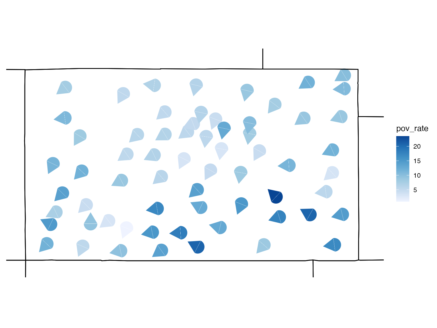
Keys for glyph maps are not automatically generated with
build_gmap and must be created separately with
build_gkey. It is important that the key arguments match
the map arguments.
# build a glyph key
usGlyphKey <- build_gkey(data = co_data, glyph = "icone")
view(usGlyphKey)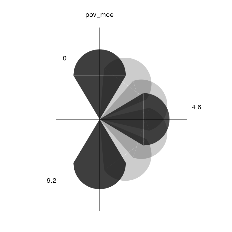
Maps and keys can be viewed together with
attach_key.
attach_key(usGlyphMap, usGlyphKey)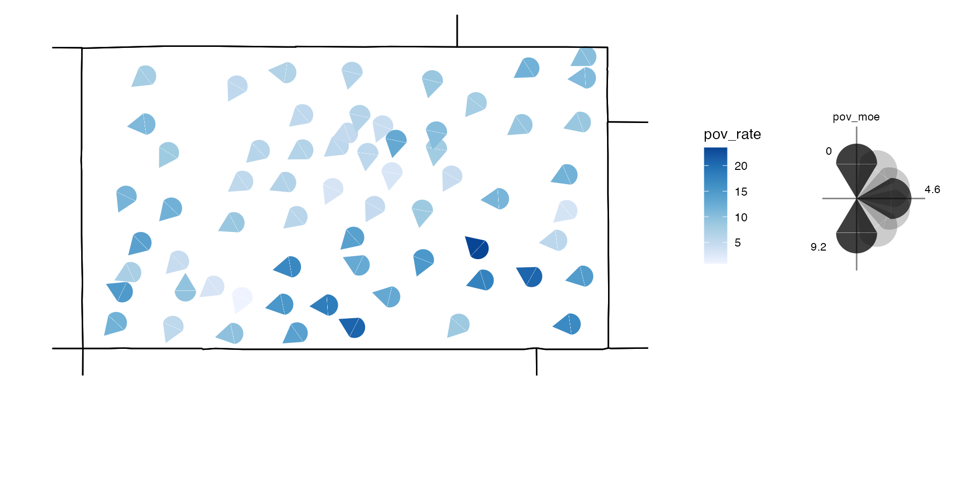
You can change the size, shape, and colour of the glyphs as well as add different borders.
# build a glyph map
usGlyphMapDif <- build_gmap(data = co_data, geoData = co_geo, id = "GEO_ID", size = 70, border = "county", glyph = "semi", palette = "Reds")
view(usGlyphMapDif)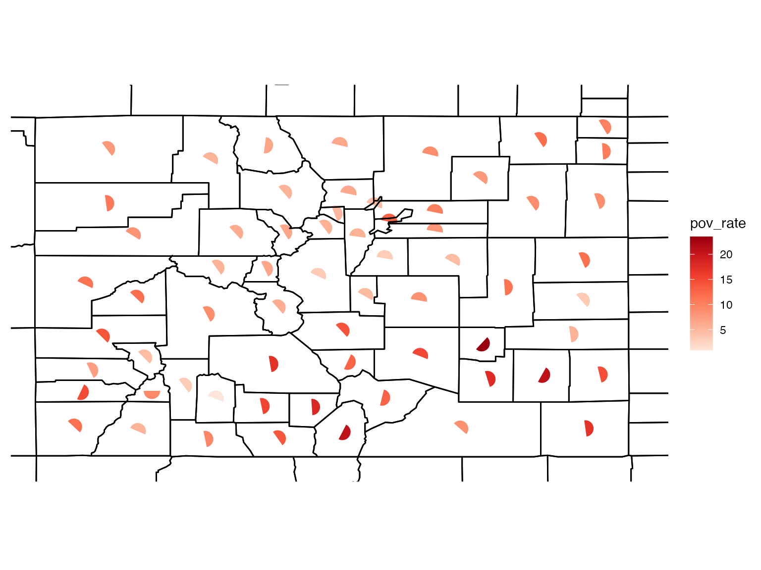
Building exceedance probability maps
Exceedance maps plot the probability of exceeding some nominated
threshold of concern. The UB dataset included in the
package contains pre-calculated exceedance probabilities. However, the
us_data data frame does not contain pre-calculated
exceedance probabilities, and these will therefore need to be generated.
First, a threshold needs to be selected - let’s choose a poverty rate of
30%.
# load data
data(us_data)
data(us_geo)

# format the data
poverty <- read.uv(data = us_data, estimate = "pov_rate", error = "pov_moe")

# check variable quantiles
quantile(us_data$pov_rate)
## 0% 25% 50% 75% 100%
## 0.0 8.1 11.3 15.1 45.4An exponential distribution is an appropriate choice for this
application (a normal distribution would not be). A list containing
information about the distribution and threshold is passed to the
build_emap function, where the probabilities are calculated
and plotted. Below is an example of how to prepare this list.
# define probability distribution (exponential distribution)
pd <- quote({ pexp(q, rate, lower.tail = FALSE) })

# define argument listing
args <- quote({ list(rate = 1/estimate) })

# capture distribution and arguments in a single list
pdflist <- list(dist = pd, args = args, th = 30)
Finally, we build the exceedance map using the
build_emap function. We need to supply the formatted data
frame, instructions for calculating the exceedance probabilities, and
information about map design.
usExcMap <- build_emap(data = poverty, pdflist = pdflist, geoData = us_geo, id = "GEO_ID", key_label = "Pr[X > 30]")
view(usExcMap)